Travel journal #2 : The plaques of Kelvingrove
Update to my last post: I'm gonna try to get the ferry tomorrow!
And update to the update: I just got a text saying... the ferry might be cancelled. Ongoing power cut due to the storm. Will let you know how that goes, I'm sure.
Anyway, that's not what I'm here to talk about. This afternoon I had a little free time and I figured I should actually bestir myself and see something in a city I've never spent proper time in. So I took a little walk down Byres Road and along to Kelvingrove Art Gallery And Museum. This is Glasgow's "proper" museum? You know, the place where they keep the important stuff. And I can report I had a nice time getting very brain-tired from looking at a lot of art. Lots of thinking about colours and stuff. And also there was a man playing on the big organ?
But that's not what I'm here to talk about. What I'm here to talk about... is the particular tone that their little gallery text plaques sometimes take. I think this was the one that made me take notice:
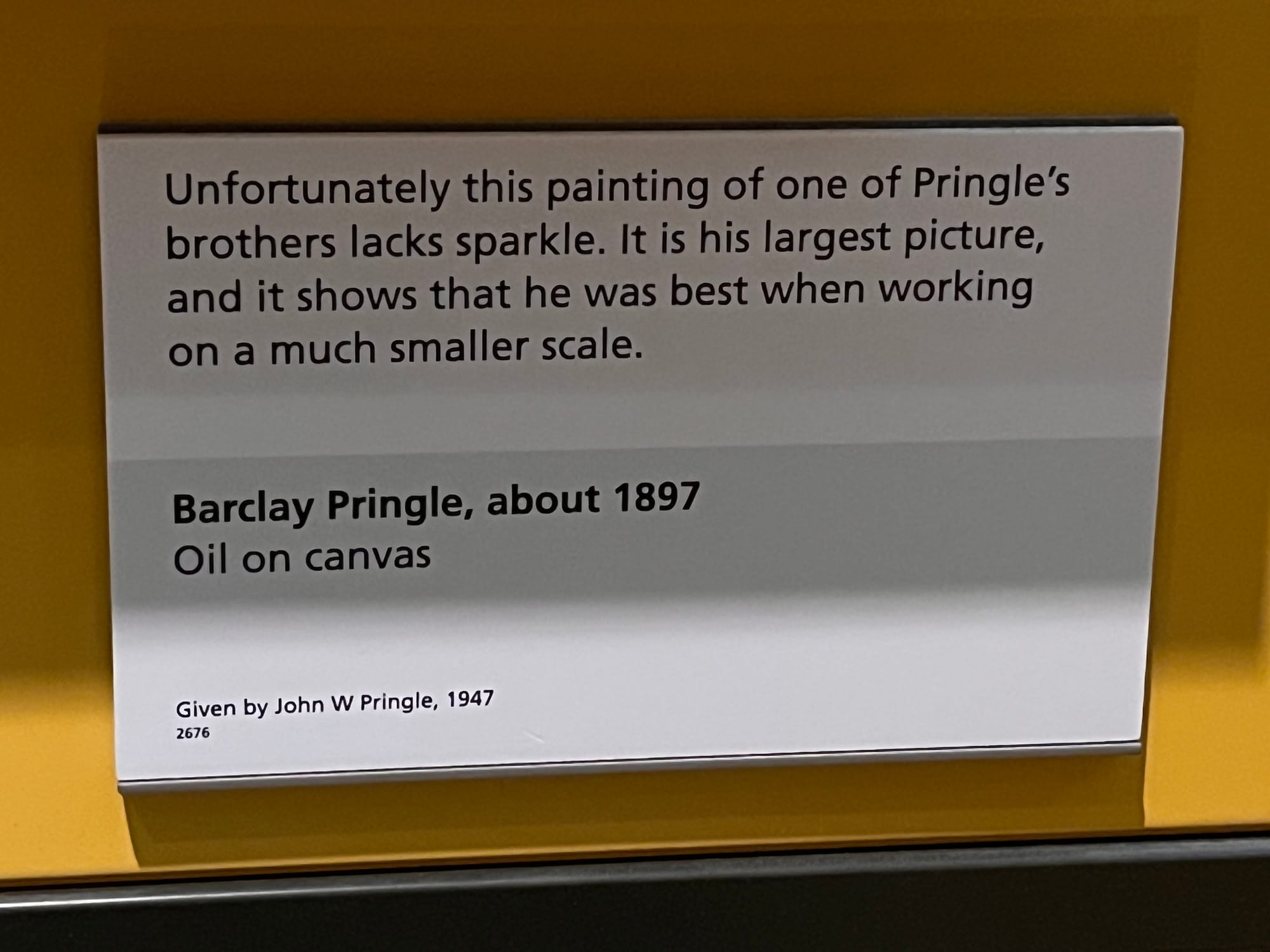
Isn't it bitchy! The amount of judgement put into it! We get a little bit of contextual info (it's his brother, it really is bigger than all his other work), but mainly it's just... judgement, uncut judgement.
Here's a few more from the little Pringle showcase they have. Don't worry, he does like Pringle after all:
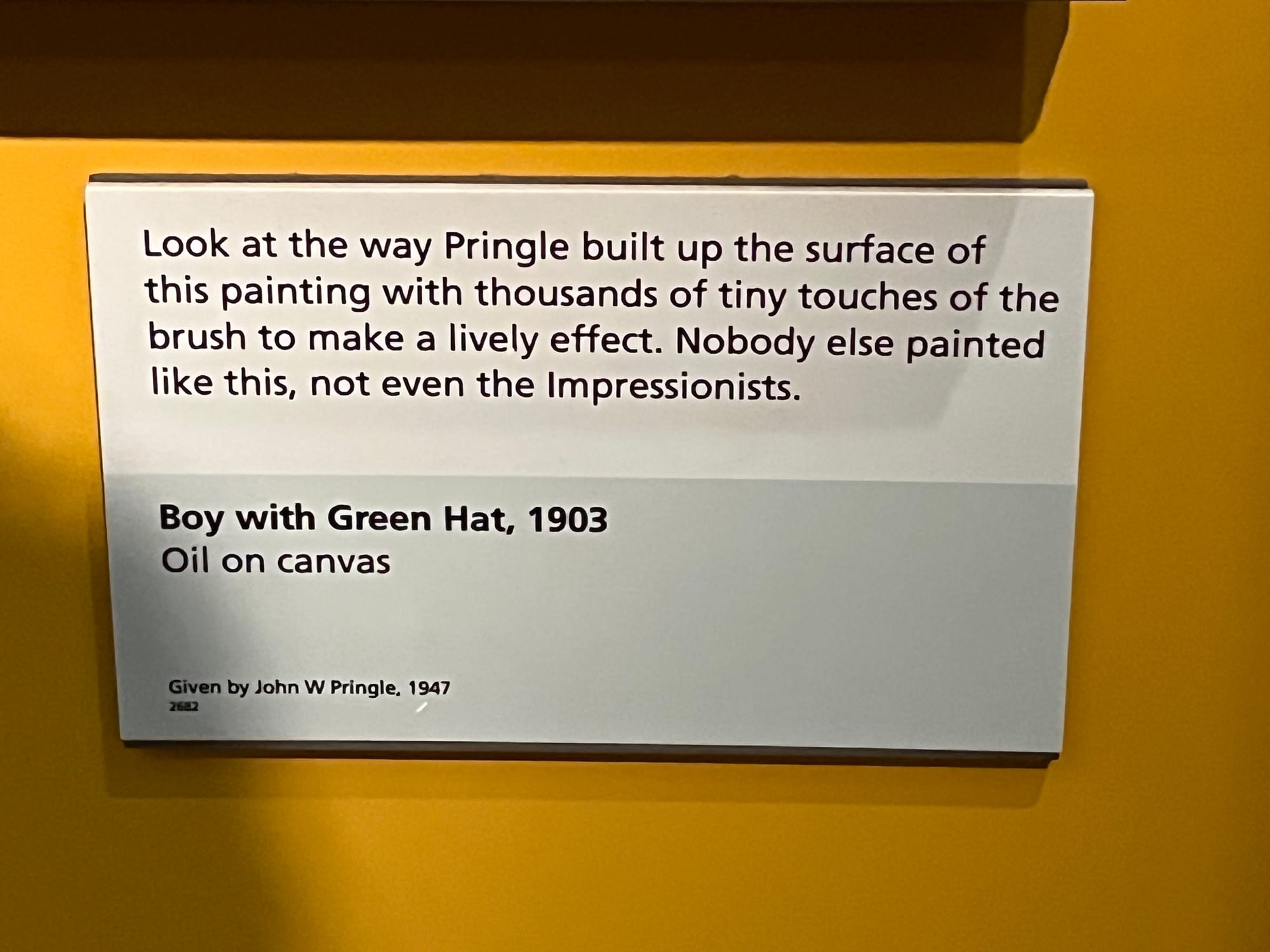
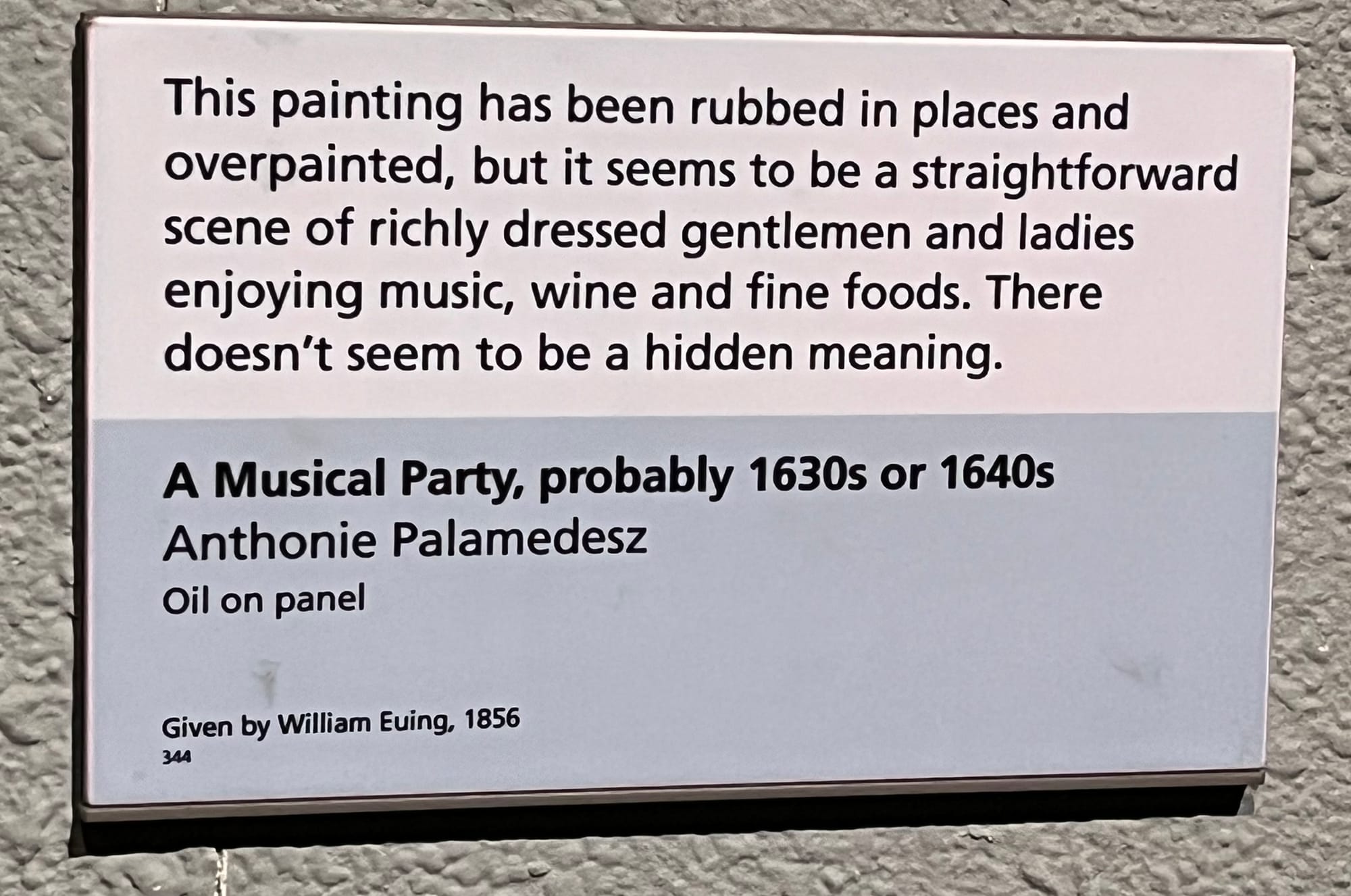
I mean, personally I'm not sure I agree with either of these statements? But I do enjoy reading them. Here's one pic with an actual painting in, just so you have some idea of what we're dealing with:
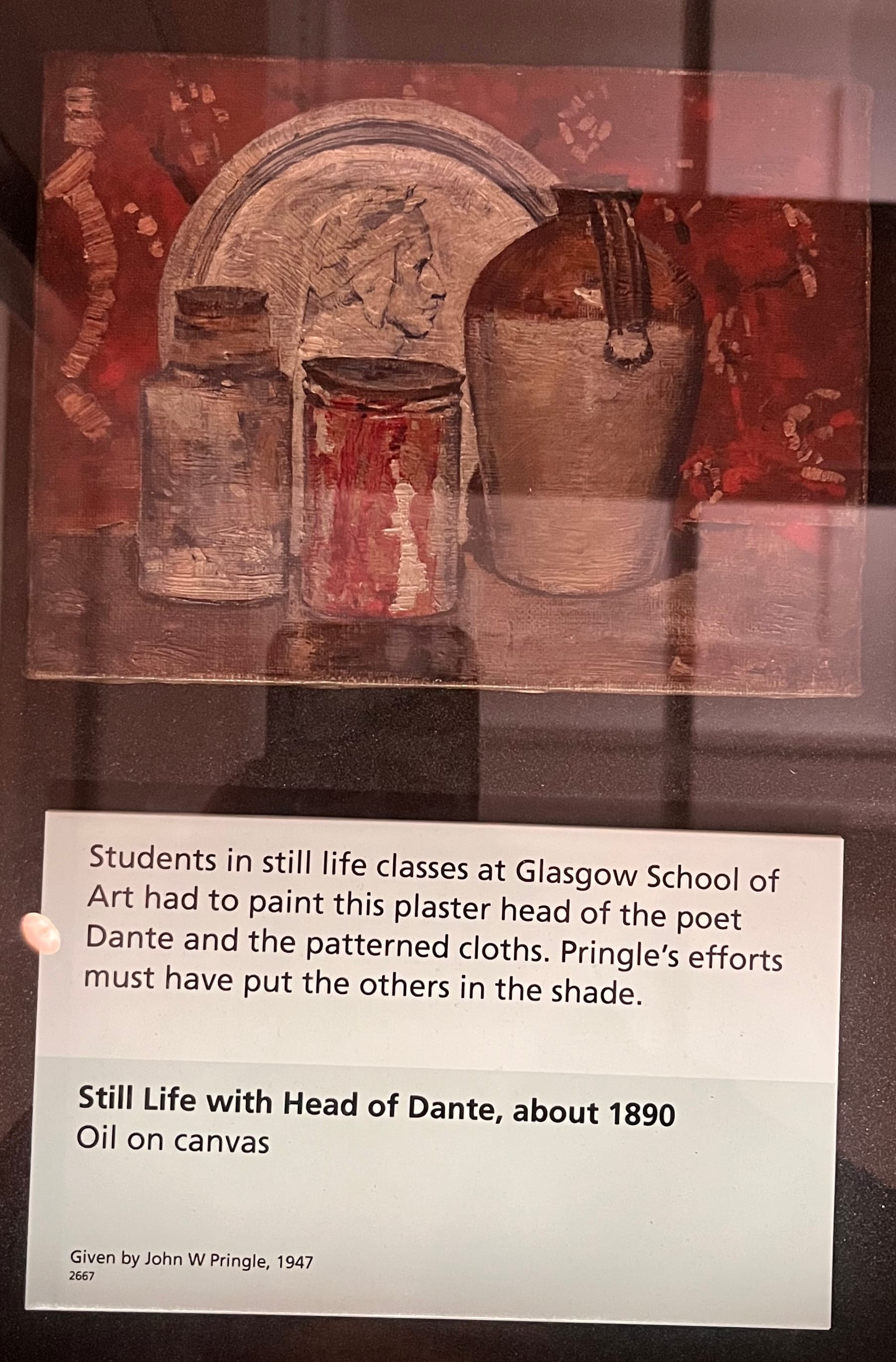
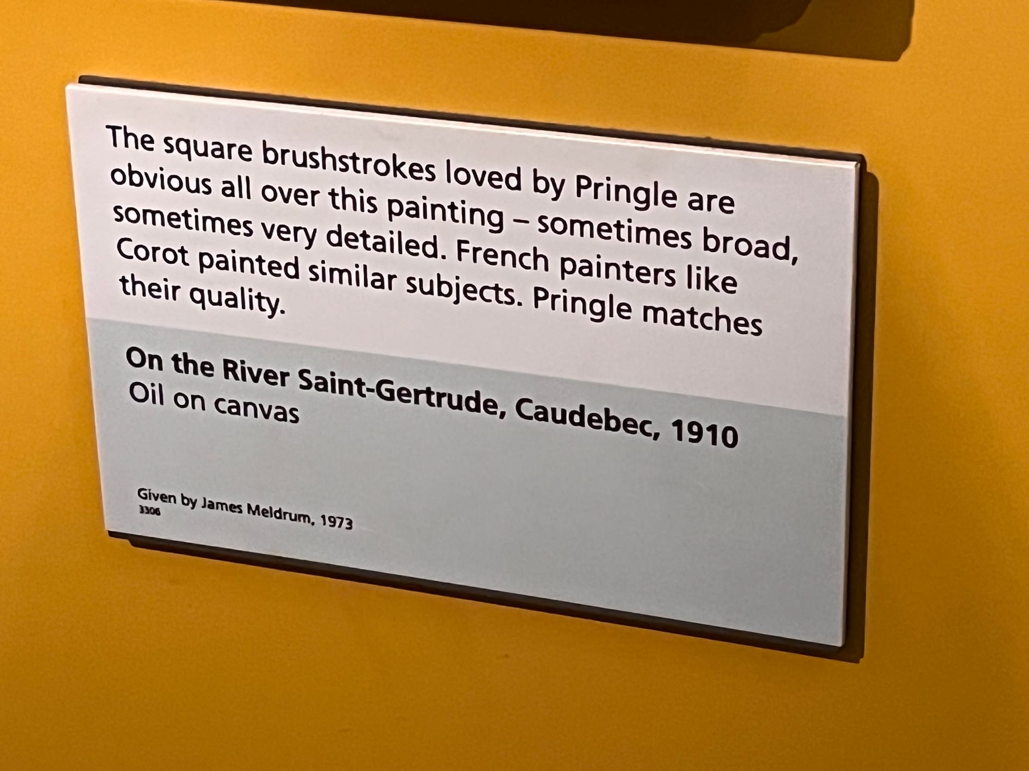
The speculation! I mean and also it's a perfectly fine still life but nothing to write home about.
Any more context on Pringle before we move on?
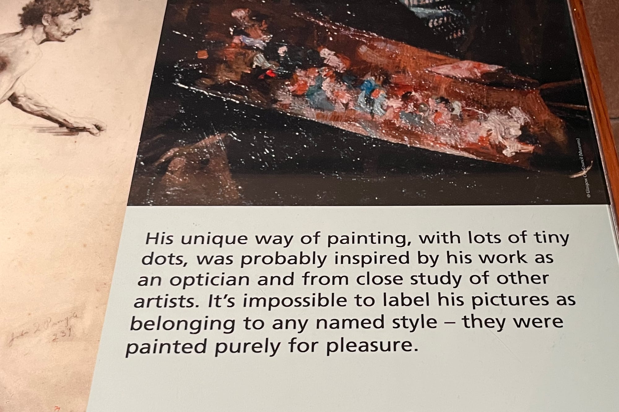
I mean, like, I do enjoy having the context of him being an optician related (it's mentioned a few times). Probably did come from looking at other paintings too, yeah! Generally that's one way that artists develop their style. But also fascinating is the binary drawn between painting in a named style and painting for pleasure. Like I get that he's an amateur painter, and I get that the museum has collectively decided that he's good enough to get an exhibition, but... are the more famous painters suspect because they painted well for the wrong reasons?
Anyway, it's not just Pringle that gets this treatment. Some big names get the sharp edge of the tongue, too:
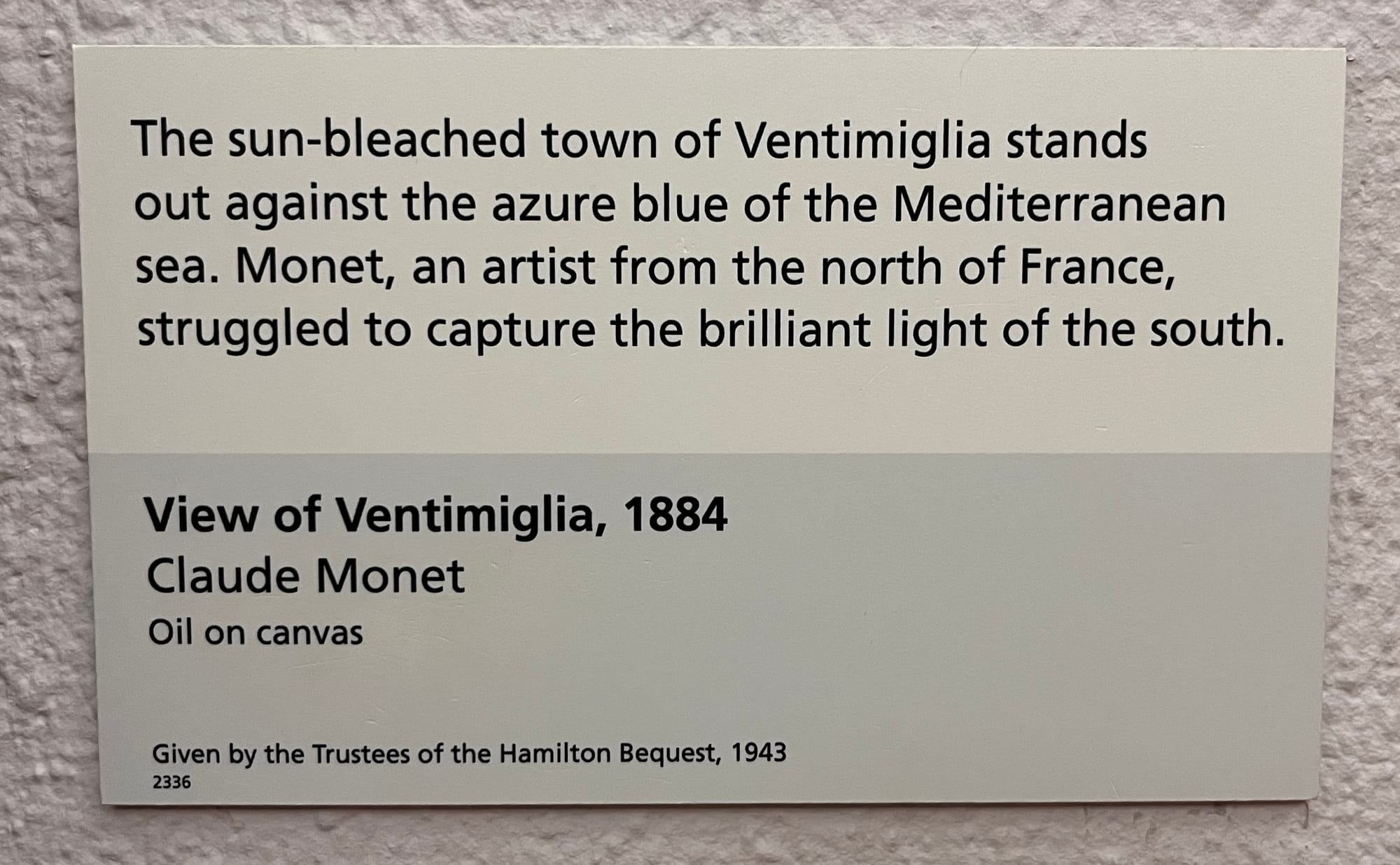
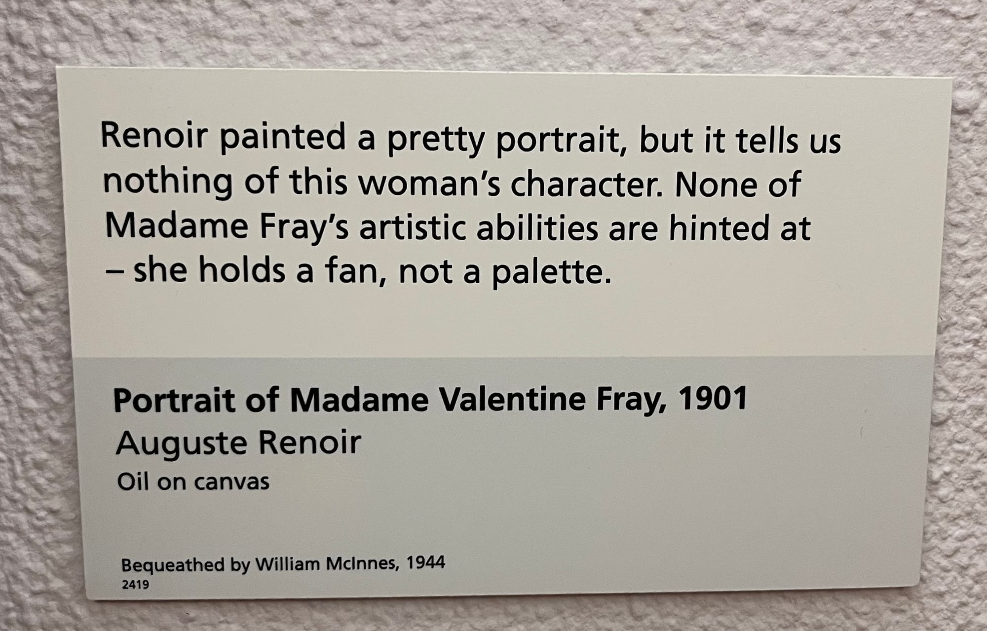
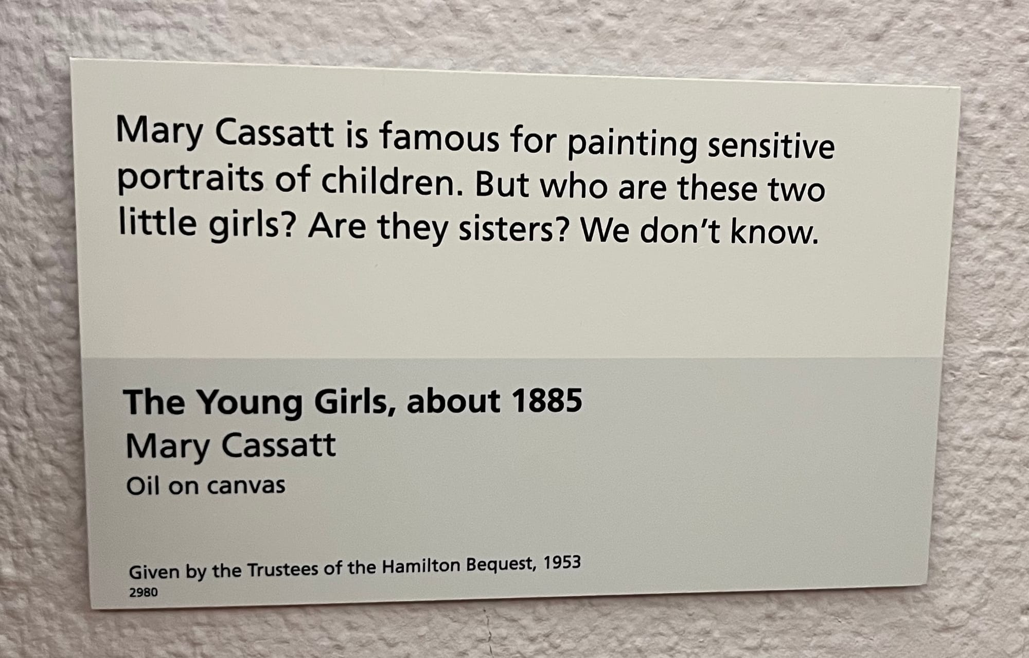
Look, I worry that this post is tipping over into seeming like I'm making fun of this writing. I'm not! I genuinely enjoyed reading it as I walked around. Often when I'm in a gallery I try to avoid reading wall text - I realised I sometimes spend more time with the text than I do with the work itself, and that seemed like the wrong way round. But these - I mean for one thing, they're short. And for another, the judgement seems to free me up to also have judgement of my own. Like, yeah, Monet, what do you know about the light in the south of France?? These girls do look like they might be sisters, glad to see that I'm capable of the kind of idle speculation that is cutting edge among art-knowers. And yes maybe I didn't know that Madame Wray was a painter before reading this... but also why should he paint her at work, if I was getting a Renoir done of me I'd want it in a nice frock, not covered in paint stains. The texts are engaging me and bringing me into the work. They're even sometimes informing me!
Or consider, in a run of paintings which all have metaphorical meanings, we get:
Okay! The terms of the puzzle have been expanded, "nothing, they're just having a nice time" is also an acceptable answer to the riddle "what does this painting represent?". Good to know!
And I should also say: this tone is sometimes used for more serious business. I really appreciated seeing one or two flashes of red as I was looking about, a border that indicated we're dealing with slavery:
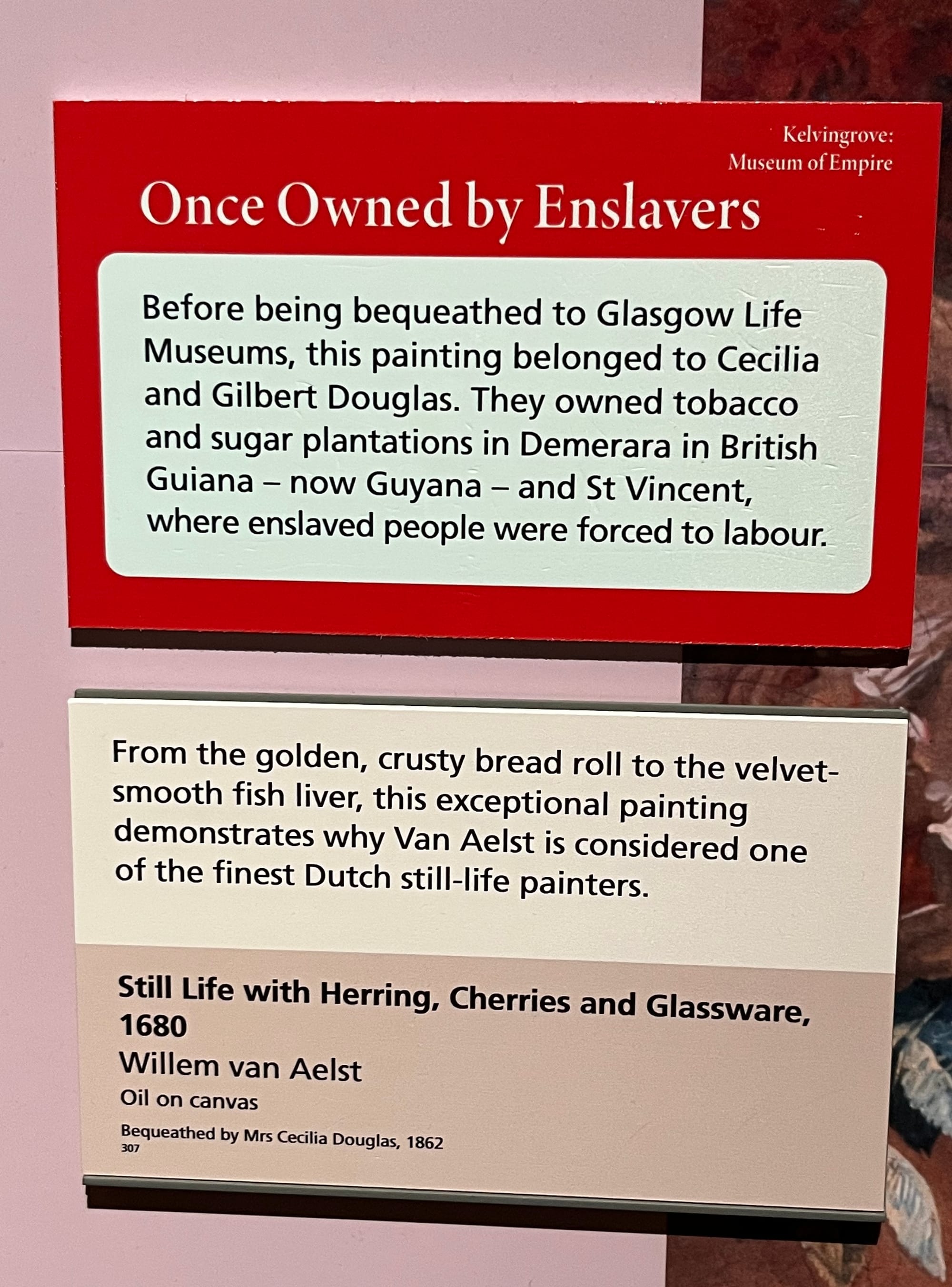
Like, yeah, that is actually context I wanted to know. It deepens my relationship with the painting. And likewise:
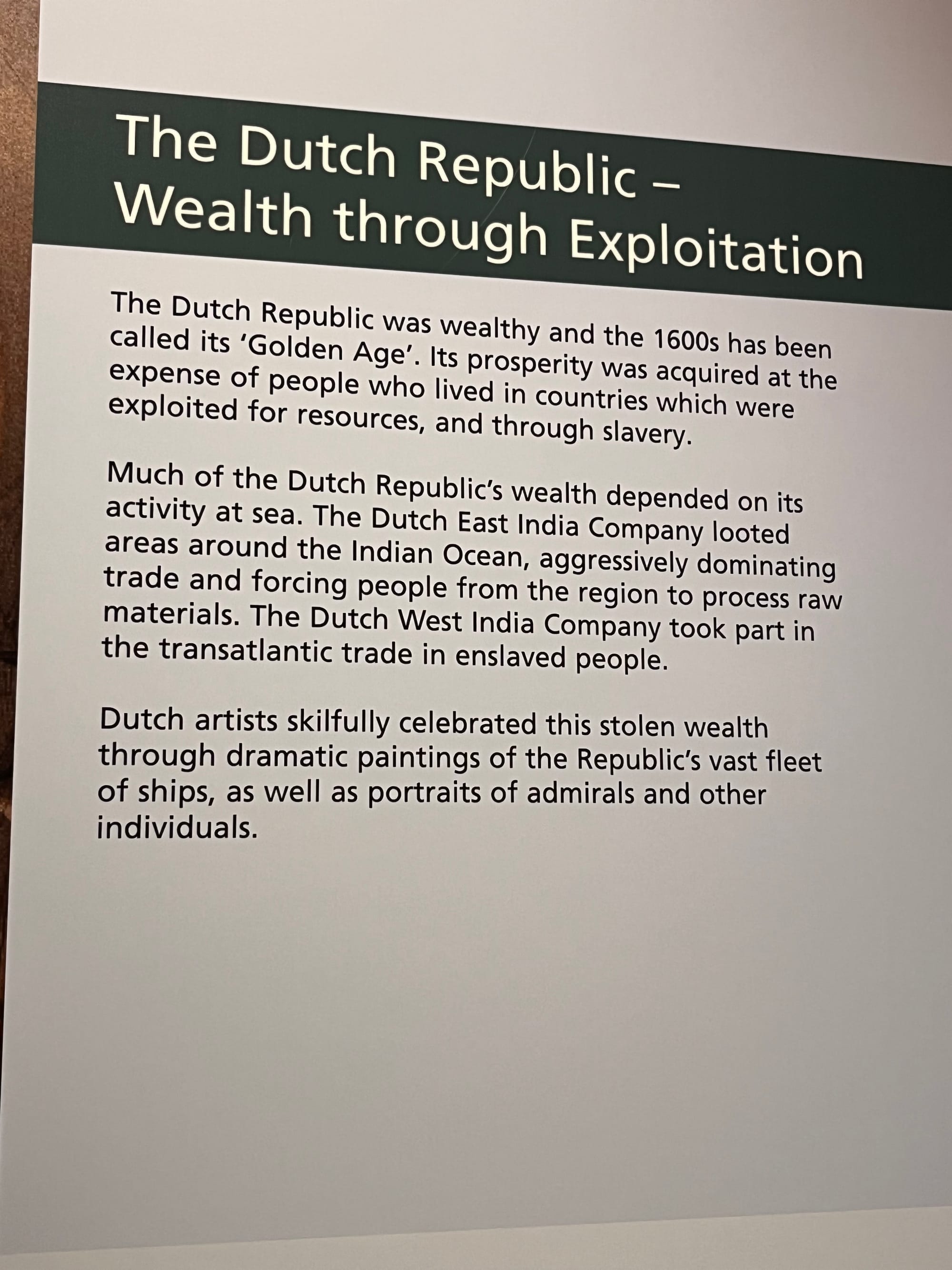
Like, beyond all the arguments about woke and so on - I guess this is what you get from not just being an art gallery, but being a broader museum? I was only going to the art bits, but nevertheless the organisation's mission is to educate visitors about the world in a broader way, not just within the world of painting.
So, should this style of curatorial text writing catch on? Will it catch on elsewhere? Well, as I was starting to write this post, I did a little Google, mainly to check I wasn't awfully stumbling on the name of the little signs. Wall text? Curatorial text? Plaques? I think it's fine, I think I don't lose my curator badge for saying any of them. In any case, I found a nice little PDF from the V&A, explaining their house style for writing these, and some general guides for writing them well. I recommend reading it if you're interested - it's short and, as you'd hope from a style guide, well-written. However! It does include a few examples for how not to do it, and 5 of those are sourced from somewhere other than the V&A, and if we examine the final one we find...
![STILL LIFE WITH JAPANESE PRINT Pringle showed an enduring interest in Japanese and Chinese art. In common with the Impressionists and Whistler, Japanese prints sometimes inspired him to paint in a different way. [28 words] Non-V&A label • What does this mean? That Japanese prints, along with the Impressionists and Whistler, sometimes inspired Pringle to paint in a different way? Or, that like the Impressionists and Whistler, he was inspired by Japanese prints to paint in a different way? • Would visitors know what Whistler's work looks like? • In what way did Pringle paint differently?](https://blog.vbuckenham.com/content/images/2025/08/Screenshot-2025-08-04-at-23.22.48.png)
It's Pringle again. Ah well.
Member discussion